How to stop viewing your data like it’s the 1700s

Quick History Lesson
In the 1780s Benjamin Franklin served as an ambassador for the United States of America to the French Court. He knew enough French to get by, but it was incredibly difficult for him to pick up the language because of the decline of this vision. He was forced to carry two pairs of glasses for his near and far-sightedness.
It was frustrating and annoying to be constantly changing glasses to see. It significantly slowed down his ability to learn the language. Finally, he created a solution that combined both lenses of both glasses into one.
When writing to his friend about his invention, he said, “… when one’s ears are not well accustomed to the Sounds of a Language, a Sight of the Movements in the Features of him that speaks helps to explain, so that I understand French better by the help of my Spectacles.”
He sliced the lenses of both in half horizontally. And now, people are still using this invention, the bifocal glasses today.
So what does this have to do with my project data?
Just like how it was annoying and frustrating for Ben to switch between glasses to see, it is annoying to switch between multiple screens of our project data to see the various data sets we need to see to make decisions and adapt to change in our organizations.
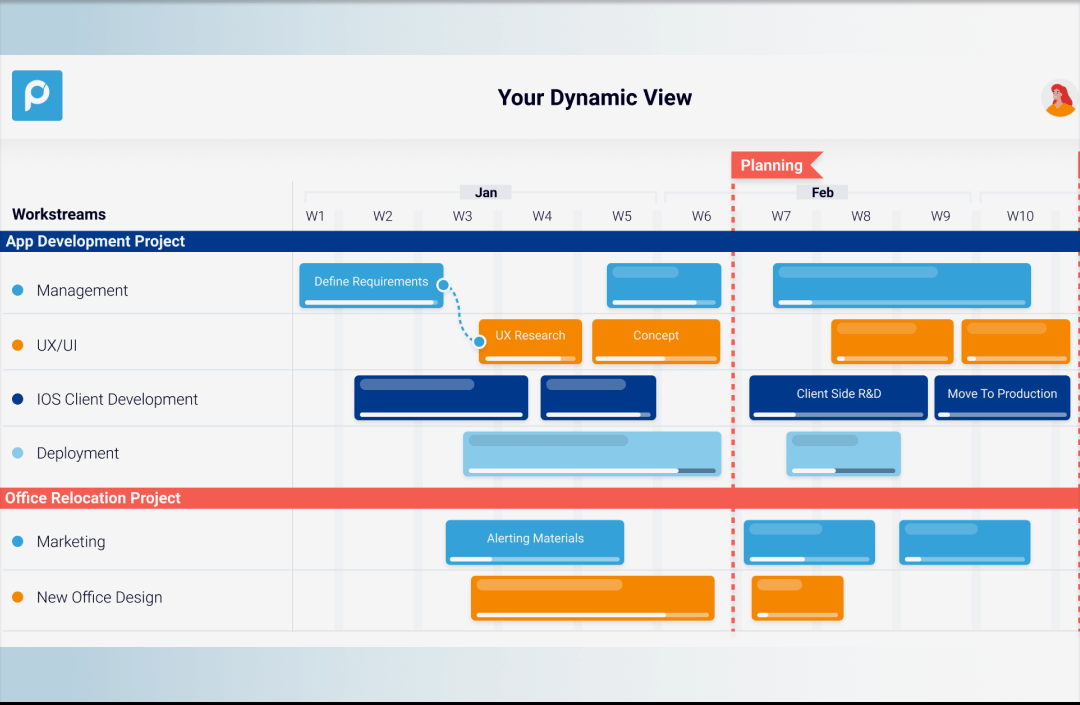
What if there was a solution that enabled us to “slice” our project data so that we could “see” a customized view in one screen of related and various parts of our project data on one screen? You know your projects and data better than anyone else. Yet, having to toggle and create a mental picture of what the data story really looks like can be frustrating and error-prone.
Customized Project Data on One Screen: Dynamic Views
There is a solution in the industry that provides that exact value and custom data view. That solution is Proggio’s dynamic views feature.
Check out this video to see how it works:
How custom data views clarify coordination and mitigate risk
No one likes it when their work is harder than it needs to be. Just like how Ben didn’t like the excessive work of constantly changing out glasses to see, we shouldn’t have to settle for constantly clicking through our data to give us the data we need to make important decisions. Here are a few ways that custom data views, like Proggio’s dynamic views, can save resources.
Coordination & Risk
As more and more people and teams become involved in a project or portfolio, the more and more complex the coordination becomes. Sometimes there are parts of projects or portfolios that are related or dependent on each other but aren’t necessarily in the same project. By having functionality like dynamic views, you can compare the related parts side by side to mitigate risks.
In a recent study of project management, risk management comes in with 40% of respondents saying as the most important project management functionality.
According to a leading science researcher, the brain is 65% more likely to recall information that is visual compared to 10% of information that is text-based.
Use a tool that can visually keep everyone on the same page. With a tool like dynamic views, users can see the potential issues on one screen to quickly identify gaps and how the whole team, no matter what project they are working on, can work together. Harness the power of visual data not only coordinates but empowers your team with clarity about how to work together and mitigate risks.
20/20 Vision of Your Data
We are in the decade of the 2020s or we like to think of the 20/20 vision era of project data. Stop wasting your time, energy, and effort on outdated data visuals. Empower to see custom views of any parts of our portfolio or projects on one screen. If Benjamin Franklin could do it over 150 years ago, so can you.
Start empowering your team to coordinate visually and mitigate risks intuitively to reach operational excellence and reach your business goals faster.