Why Visual First Tools are the “Stanleys” of PPMs

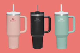
Chances are that this summer you will see someone carrying one of these…

This bottle has achieved, “a 275% increase in sales year over year…” [1] The water bottle has been around for forever. In fact, Stanley, the brand behind the tumbler, has been making gear for active lifestyles for over 100 years. Realizing a few changes could leverage a huge impact, Stanley redesigned the water bottle.
“It features a lid with a removable straw, a handle, and an insulated body that is tapered, allowing it to fit in a cup holder.” [2] By knowing that the customer needed these few changes, Stanley applied their industry expertise to make a product that people can’t live without. As one customer said, “It’s one of those products that when you try it, you just don’t really go back to any other version of any other product,” [3]
So what does this have to do with my project portfolio management platform?
The Gantt chart has been around for over 100 years. The spreadsheet has been around since the late 70s. So why do we force ourselves into using project reporting and management tools that are outdated and holding us back?
Hear me out.
Organizations deserve a PPM that can manage real-time, complex data, and not be managed back with dual data entry. Teams deserve a tool that can organize the data visually so decisions can be made at a glance with real-time data. And finally, rather than chasing down information, executives and teams need a tool that can “fit” and keep up with evolving team goals as a modern solution for planning and reporting.
Here is why organizations that use visual first PPMs with real-time data never go back to other outdated solutions.
The size, The data
“56% of project managers don’t have access to real-time project KPIs” (Source) It’s 2023. A stat like that is honestly unacceptable.
In the modern era of evolving business goals, constant changes are happening that organizations must adapt to. In order to adapt, you need good data. In order to have good data, you need real-time data that can help you make fast predictable decisions.
“It is estimated that almost 54% of all organizations working on projects fail to effectively track their KPIs in real-time. Organizations generally waste 12% of their resources due to ineffective project management.” (Source)
Data, no matter how complex, should be centralized. It should be clear and intuitive to understand.
“Ensure you have the ability to adapt to changes. Seeing how a priority change or a roadblock will impact future milestones, project completion, and deliverables across the portfolio is essential. Without it, the organization is flying blind and crossing its fingers that everything will work out in the end.” (Source)
So rather than scrolling through ugly and massive Gantt charts and spreadsheets, select a tool that can do it all for you on one screen, with clear visuals that are easy to read, and don’t cause more stress.
The handle, The visuals
Think of the water bottle handle as the visuals when it comes to project and portfolio data. Visuals are the way for organizations to instinctively “get a handle” on their data (pun intended). Rather than being at the mercy of data being dropped with outdated tools, use a tool that puts you in control of the data.
Visual first project management platforms take all the complex information and puts it all on one screen.
As Yaniv Shor, Proggio co-founder and CEO, said in a recent Forbes article, “The problem with using Excel or even Gantt charts to track project status is that they’re perpetually outdated. The entire team depends on the PM to make updates to the timeline by culling through emails, Slack messages, and sticky notes. Meanwhile, work on the project is ongoing, so there’s virtually no way the PM can keep up.”
He continues, “Look to incorporate real-time visibility to help your team plan ahead and be ready for the next task or phase. A clearer view of project statuses can also allow PMs and project leaders to spot roadblocks sooner so they can adapt quickly before falling behind schedule. (Source)
So now that you know why visual first solutions help you “get a handle” (I promise that is the last pun), it’s time to discuss how the visuals and data can fit into a modern solution.
The cupholder bottom, the modern solution
“PMs often spend hours compiling data from a myriad of sources into a PowerPoint deck to report to stakeholders. By the time this report is delivered, it’s already old news. This is not only an inefficient use of PMPs’ time and talent, but it also means leadership never gets a clear picture of project status. It may not find out things are going poorly until they’ve gone completely off the rails, putting the entire project in jeopardy.” (Source)
“Look to establish systems for efficient, real-time reporting in order to keep stakeholders up to date, which can save the entire organization a tremendous amount of time. Reporting is a critical part of project management, so addressing it upfront can prevent a huge hassle and headache down the road.” (Source)
Just like how the Stanley tumbler is designed to fit into a vehicle’s cupholder so it doesn’t fall, tip or spill as you drive, you need a PPM that doesn’t waste time and resources. You need a PPM that fits into the evolving expectations of your organization’s business goals.
Choose a PPM solution that can “fit”, that can keep up, that can enable, that puts your executives in the driver’s seat, and your organization on the fast track to efficiency, strategy, and reaching your business goals with ease.
So where do I get my PPM Stanley?

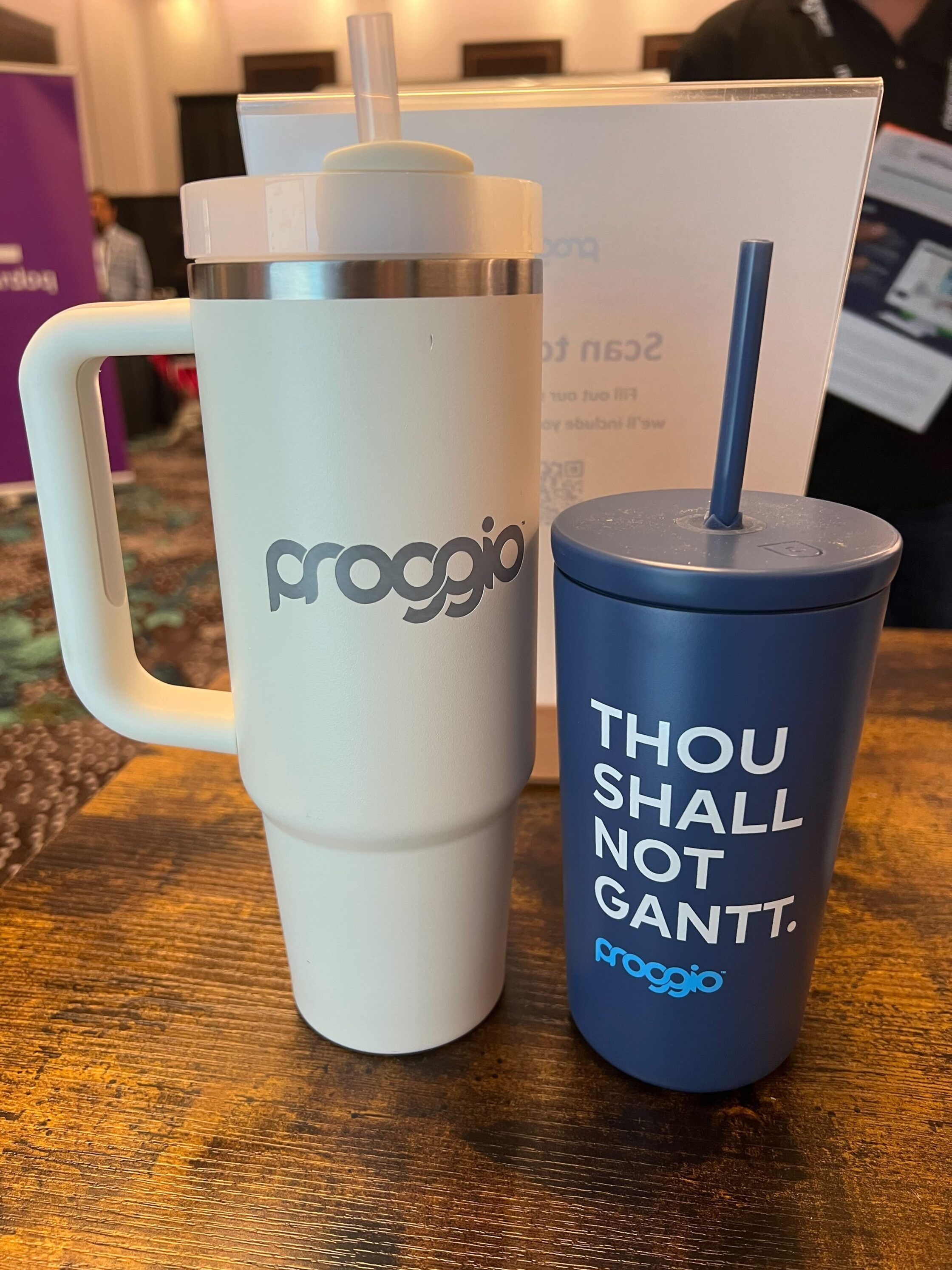
All of the product features mentioned in this article are part of Proggio, the adaptive PPM solution. interested in learning more about how Proggio is the modern solution that your organization is looking for, reach out to us here. If you mention that you read this article you will have chance to win your very own Proggio Stanley.